Pastel weddings get a bad rap, and we kind of get why. Done lazily, they look like a fancy gender reveal: powder blue tulle, pale pink hydrangeas, ivory napkins, and nothing in the room with any backbone. We’ve sat through versions of this. We’ve also seen versions that made us text the photographer mid-toast.
When you shop links on our site, we may earn a small commission at no cost to you. Learn more.
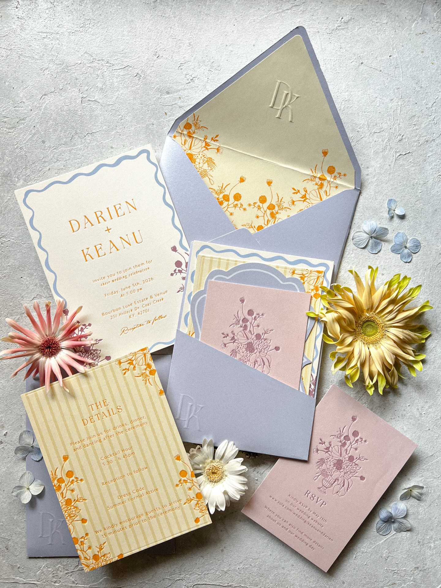
We love a pastel wedding (we really do!). The ones that read baby-shower are always missing the same exact thing: ONE anchor color. Add chocolate brown taper candles to a blush palette, or oxblood velvet to lavender, or brass flatware on sage linen, and the same exact pale pink hydrangea reads editorial instead of nursery.
We pulled the seven pastel palettes our editors keep saving on Pinterest, the ones our NYC vendor-matchmaking brides keep asking about, and the ones our favorite designers are actually executing this season. Each palette has the anchor color that does the heavy lifting, plus the one thing to skip if you want it to read like a wedding instead of a sip-and-see.
1. Butter & Espresso
#F4DDA0
#FFF5E1
#C8A87A
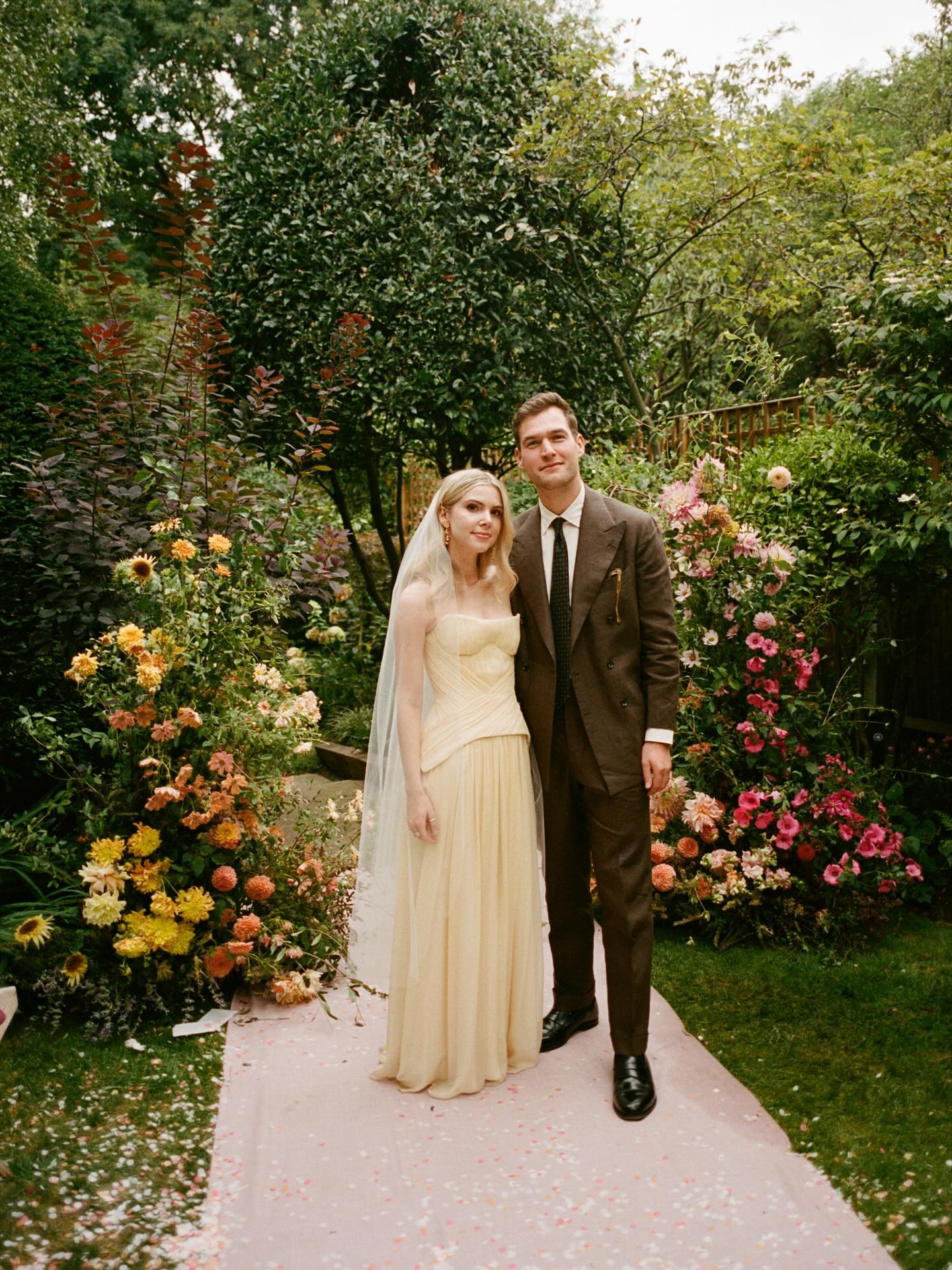
Butter yellow has been the breakout color of every spring 2025 runway, and we’ve watched it take over wedding Pinterest by mid-2026. It’s also the pastel most likely to lapse into Easter brunch if you let it. The fix is espresso brown: the groom in chocolate (yes, instead of black or navy), taper candles, velvet ribbon on the bouquets, a chocolate-printed menu card. Pair it with raw silk linen in cream (skip the bright white) and brass flatware in a worn finish, not high-polish gold. Florals lean ranunculus, garden roses, and the slightly unhinged amount of mustard freesia your florist will try to talk you out of. Let them include it.
Best for: Late spring and early fall.
Skip: Pale pink anything. Butter yellow does not need a pink supporting cast (that combination is the baby shower). Sub in terracotta or rust if you need extra warmth.
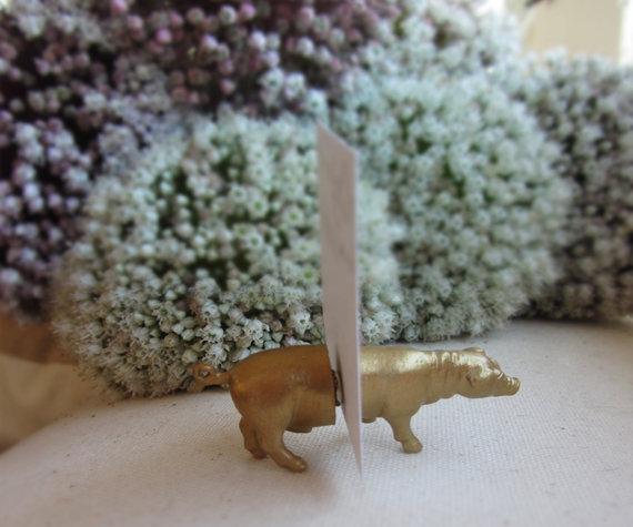
D’light Online Elegant 10-Inch Chocolate Brown Taper Candles, Set of 12
The #1 pick for anchoring a butter yellow palette. Espresso-toned tapers, dripless and unscented so they don’t fight your florals. Order three sets per long table and let your florist tuck them between the arrangements.
2. Lavender Smoke
#C8B6D4
#E9E3EE
#F4DDA0
#B08D57
Lavender goes baby shower fastest of any pastel. It skews sweet, the florals are easy (one trip to Trader Joe’s and you’ve got stems), and it photographs “first communion” in any light that isn’t perfectly art-directed. Aubergine is what saves it. We mean deep, plum-leaning, almost-black aubergine, used in linen runners and bridesmaid dresses and the inside of your invitation envelope. Add antique brass for the candlesticks and you have a wedding that looks like it cost twice what it did. Florals: lisianthus, sweet pea, scabiosa, and a generous amount of greenery in a darker tone (dusty miller in its grayer moods, eucalyptus parvifolia).
Best for: Spring weddings, garden venues, anywhere with old stonework.
Skip: Tulle. Anywhere. Lavender plus tulle is the death zone. Use linen, velvet, or organza instead.
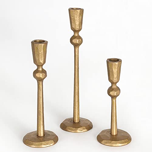
Antique Brass Taper Candle Holders, Set of 3
The #1 pick for warming up a lavender palette. Three different heights in weathered antique brass. Cluster them in the center of round tables with lavender taper candles to give the palette the warm-metal grown-up note it needs.
3. Sage & Clay
#B4BFA6
#E8D5C4
#DBA791
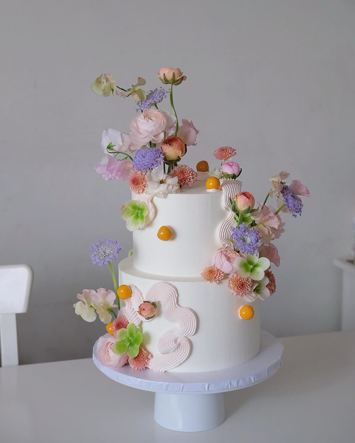
Sage has been on every wedding mood board since 2021 and most of them look exactly alike. The version we love in 2026 swaps the standard sage-and-blush combo for terracotta: clay vessels, rust-colored linens at every other seat, terracotta wax seals on the invitations. The whole palette grounds in forest green, which we know isn’t a pastel, but you need it. Without a true dark green somewhere in the room (think eucalyptus, olive branches, or a moody charger plate), sage floats. With it, the palette starts to look Spanish, or Provençal, or any of the European-villa vibes your Pinterest board has been leaning toward. The sage hellebores tucked into a multi-pastel cake (see above) are exactly how this anchor color earns its keep on a single statement piece.
Best for: Outdoor weddings, late summer through early fall, anything with an olive tree.
Skip: Mason jars. We’re sorry. Use clay or amber glass vases instead.
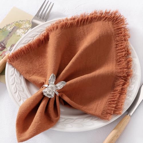
DeZerlor Terracotta Cotton Linen Napkins with Fringe, Set of 12
The #1 pick for grounding a sage palette. Generous 20-inch squares in a rust-leaning terracotta with a soft fringed edge. Use them at every other seat for the alternating sage-and-clay table effect without paying for custom linen rentals.
4. Blue Hour
#BBD3E0
#F5F1E6
#F4D1CB
#FFCBA4
Powder blue is the original baby shower pastel, which is exactly why getting it right is satisfying. The combination that works is the one menswear’s been doing for a century: pale blue plus navy plus champagne. Bridesmaids in navy (NOT powder, please), groomsmen in mid-blue suits, table linens in pale blue, candlesticks in champagne gold, and a navy velvet runner down the head table. Florals stay white and cream (think hydrangea, lisianthus, white delphinium) because adding blue flowers to a blue palette is the trap. Your “something blue” is the room. Save the actual blue flower for one statement arrangement.
Best for: Coastal weddings, ballrooms, anything with a dance floor that needs a moody after-hours feel.
Skip: Powder blue florals. We promise.
Champagne Gold Tall Taper Candles, 12-Inch Dripless, Set of 12
The #1 pick for the champagne metal in a Blue Hour palette. Metallic gold tapers in the soft champagne shade Blue Hour calls for. The extra-tall 12-inch length gives them visibility above arrangements at long-table seating. Buy two packs for a 60-person reception.
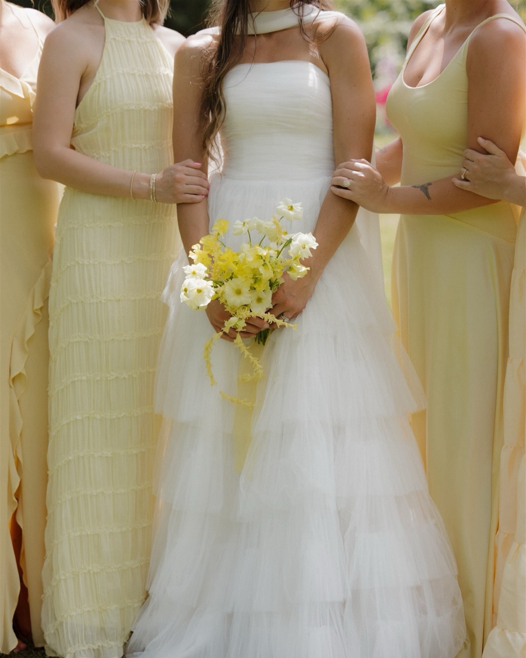
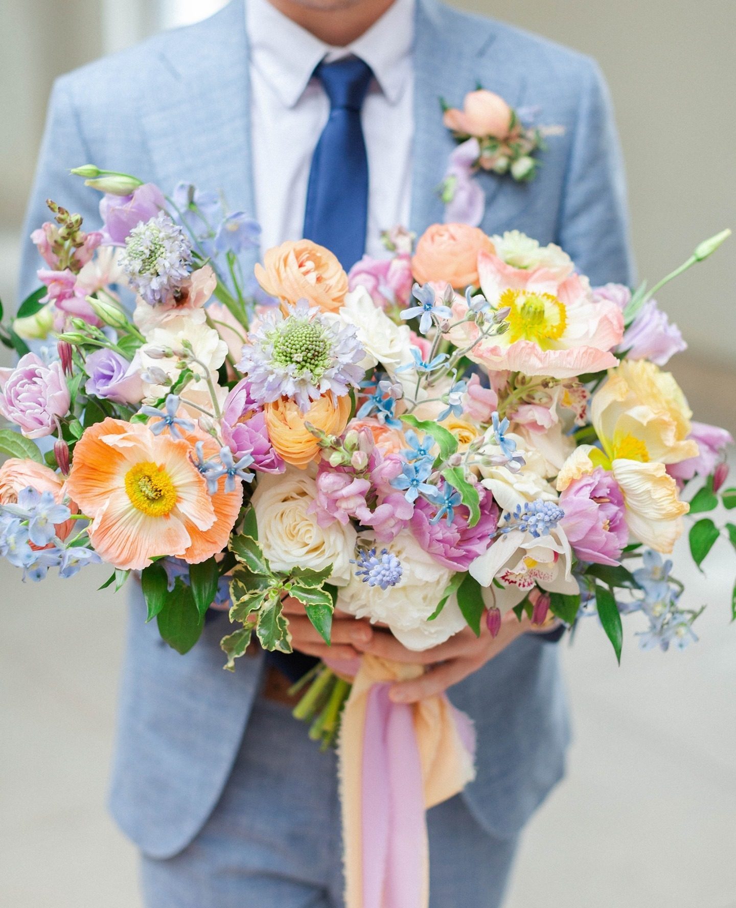
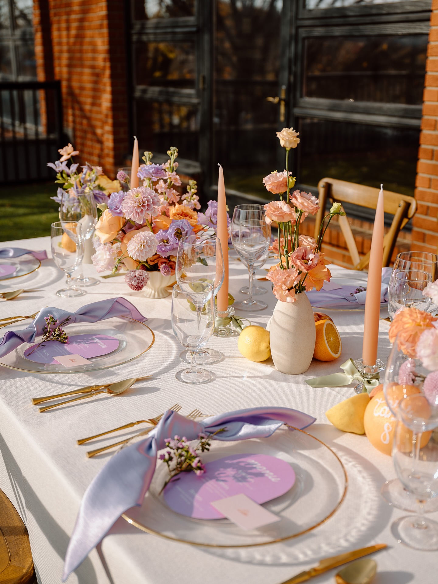
5. Blush, Peach & Sky
#F4D1CB
#FFCBA4
#FFF5E1
#8FA8B8
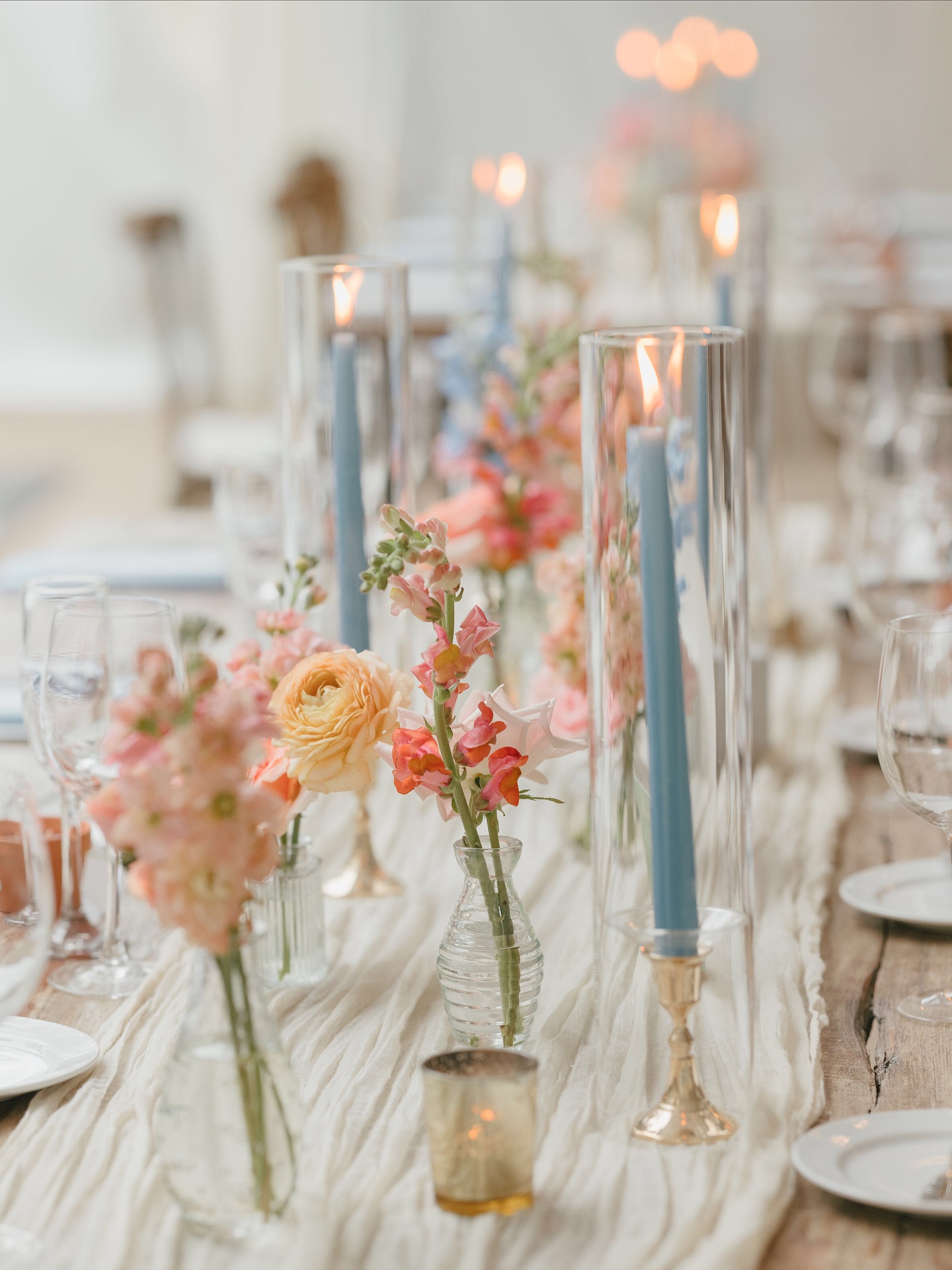
Blush has earned its reputation. It’s been the default wedding pink since 2014 and it has spent most of that time looking like a Sweet Sixteen. The 2026 move is to keep the blush but anchor it with a color that isn’t another pink. Our favorite combination: blush and peach florals (the warm cousins of blush, mixing snapdragons and ranunculus and garden roses in both tones), then dusty blue taper candles in tall glass hurricanes between every arrangement, and brass candlesticks underneath for the warm metal. Cheesecloth runner instead of stiff white linen. The blue is doing what chocolate brown does in heavier palettes: it’s the grown-up note that tells the eye this is a wedding, not a Sweet Sixteen. The blue can also show up in your “something blue” tradition, in the bridesmaid bouquet ribbons, in a printed handkerchief tied around the bride’s stems.
Best for: Year-round, especially spring weddings, garden venues, anywhere with natural light.
Skip: Rose gold (we know, we’re so sorry). And do not put the blue in the florals, keep it in the candlesticks and the linens. Blue flowers in this palette tip it back into baby shower.
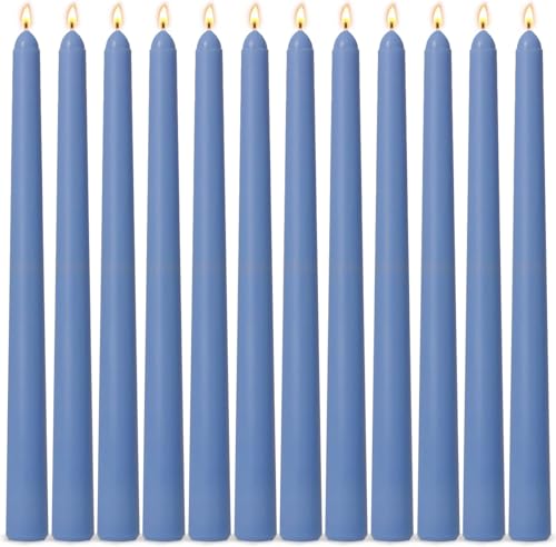
Dusty Blue Taper Candles, 10-Inch Dripless, Set of 12
The #1 pick for grown-upping a blush palette. Soft dusty blue tapers that read editorial against blush and peach florals. Cluster three in tall glass hurricanes between every arrangement, or pair with brass candlesticks for the warm-cool contrast that saves this palette from baby-shower territory.
6. Peach Orchard
#FFCBA4
#C8B6D4
#F0E3D2
#D4AF7A
Pantone gave us Peach Fuzz as Color of the Year in 2024 and the wedding industry mostly used it badly. Too much peach, too soft, too matchy. The version we love is peach as the supporting player paired with lavender as its surprise complement, then olive or rust to ground the warm tones. Florals: garden roses, butterfly ranunculus, café au lait dahlias if you can get them, lisianthus in lavender, plus dried wheat and olive branches for texture. Citrus on the tables (lemons, oranges still on the branch) reads warm without adding another color. Gold flatware ties the metals together. This is one of the easier palettes to source in person at the wholesale flower market, which your florist will love you for.
Best for: Late summer through early fall, vineyard weddings, anything outdoor.
Skip: Cool-toned silver or chrome accents. Stay in the warm-metal family.
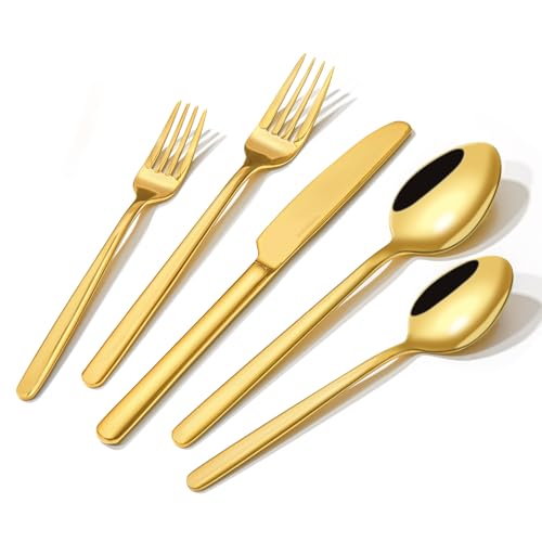
KINGSTONE Gold Flatware, 20-Piece Set for 4
The #1 pick for tying together a warm-tones palette. Mirror-polished gold flatware that holds up to dishwasher use. Buy enough sets for your guest count, skip the rental fee, and list them on Facebook Marketplace after the wedding for half of what you paid.
7. The Mismatched Pastel
#F4D1CB
#C8B6D4
#BBD3E0
#FFCBA4
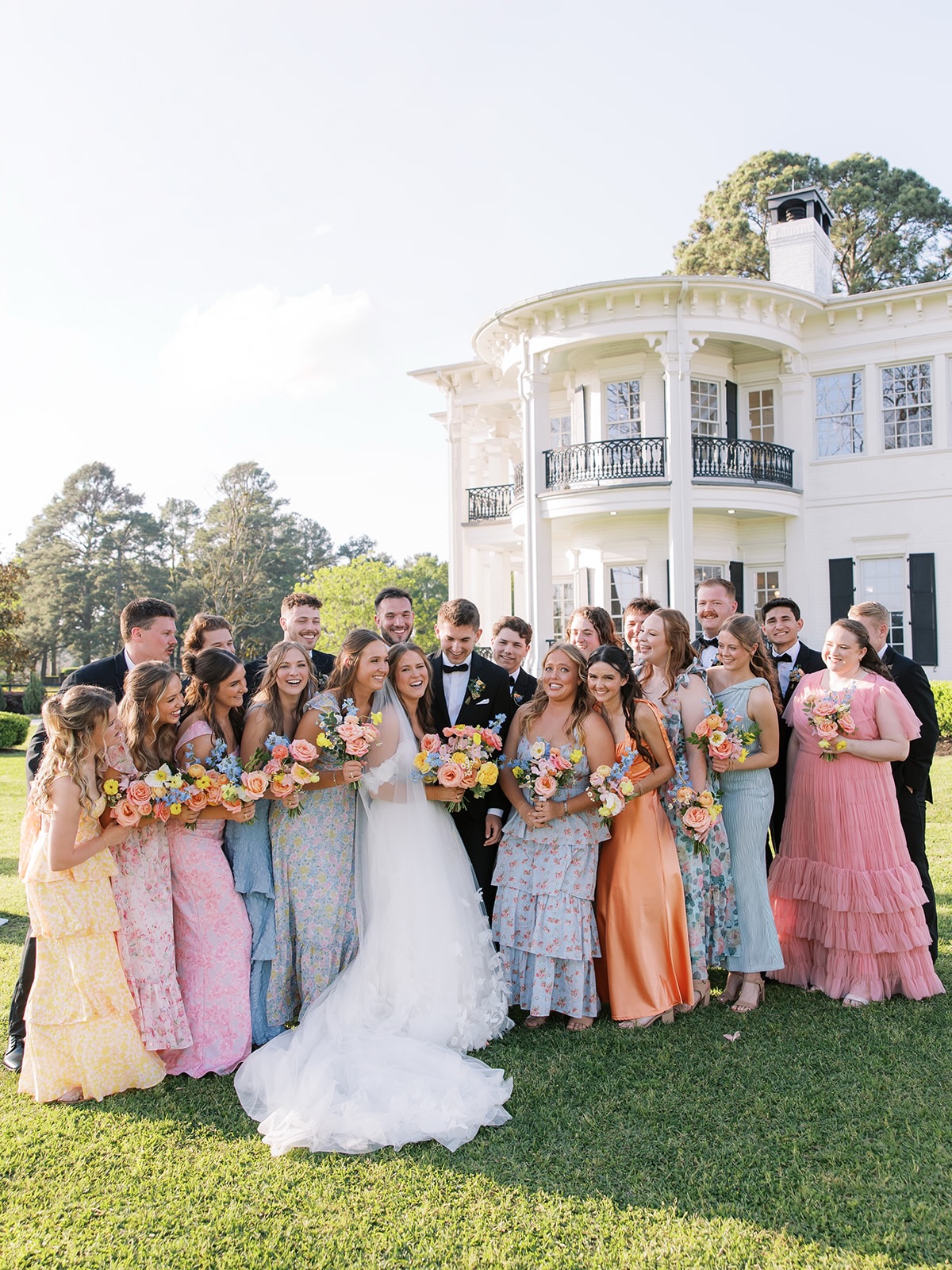
This is the trend that scared a lot of us when it started, and it absolutely works. Every bridesmaid in a different pastel, no two dresses alike, no attempt to coordinate beyond “pick something soft and pretty in this color family.” What saves it from baby-shower energy is the anchor: every groomsman in a classic black tuxedo, the venue formal (think historic estate, old mansion, ballroom, anywhere with white columns), and a bride in a true white gown with a long train. The pastel chaos becomes the bridesmaids’ job, full stop. Everything else stays grown-up. Bouquets are coordinated-but-not-matching: each bridesmaid carries a bouquet that nods to her dress without copying it, and the bride’s bouquet is the biggest, most multi-pastel of the group, basically all of theirs combined and then some.
Best for: Spring and summer, formal venues, weddings that want to feel celebratory and a little editorial.
Skip: Matching bridesmaid dresses in different colors of the same style. That’s the catalog version of this trend and it reads as “we tried.” The point is they each picked their own. Let them.
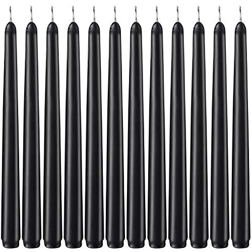
Matte Black Taper Candles, 10-Inch Dripless, Set of 12
The #1 pick for anchoring a multi-pastel palette. The single piece of black in the room (besides the groomsmen’s tuxedos) that pulls the whole pastel rainbow together. Cluster three per centerpiece for the strongest visual anchor.
The 4×6 card test (do this before you commit)
The fastest way to know if your palette is working before you book a florist is to print every hex code on a 4×6 card at FedEx, lay them out together under the light of your venue at the time of day you’ll be photographed, and take a phone picture. If anything reads chalky or washed out in that photo, you have a baby shower palette. If the darkest color in the lineup is doing visible work, you have a wedding. Five bucks at Kinko’s saves you a $30,000 misfire.
We get into the rest of the process (including how to brief your florist so they actually deliver the palette you booked them for) inside the WGM Smart Wedding Planner, which has the exact palette-locking worksheet we use with our matchmaking brides. And if you want to plug your palette plus your venue plus your guest count into a quick budget reality check before you commit to those custom chocolate brown napkins, our budget tool runs the numbers for you:
Are you overspending on your wedding? This 60-second quiz will tell you.
Most brides go into planning with a number in their head and no idea where it's actually going. Enter your budget and guest count, and get a clear picture of exactly where your money is at risk, what you're most likely to overspend on, and where you can cut without anyone noticing.
What matters most to you?
Every vendor will tell you: unless you have an unlimited budget, you HAVE to prioritize. Tell us what matters most to you so your results are specific to YOUR wedding — not some generic checklist.
Your budget has a blind spot.
What’s inside your results
📊Your budget score & #1 blind spot
⚠️Your biggest pressure point
💡Where you’re most likely to overspend & save
💰Your recommended budget breakdown
No spam. Unsubscribe any time.
FAQ
What’s the most popular pastel wedding color for 2026?
Butter yellow is the breakout pastel of the year and the most-saved on our editors’ Pinterest boards by a wide margin, followed closely by blush (still) and powder blue (always). Sage stays steady. The accent color of the year, across every pastel palette, is chocolate brown. If you’re picking one trend to pull into a softer palette, that’s the one.
Are pastel weddings out of style?
Not even a little. They’re the most photographed wedding category on Instagram and Pinterest and they will be again next year. What’s out of style is monochromatic pastel: five shades of the same family with no anchor. Every working wedding designer right now is building palettes around at least one deep or saturated accent color, which is why even soft palettes look more grown-up in 2026 than they did five years ago.
Can I have a pastel wedding in winter?
Yes, and they often photograph better in winter than in spring because the lower light gives the pastels more depth. The trick is to weight your palette toward warmer pastels (butter yellow, peach, blush) and skip the cool-toned ones unless you have an anchor as dark as our navy or oxblood examples. Add candlelight everywhere. Lots of taper candles. Always more than you think.
What pastel palette is best for an outdoor wedding?
Sage & Clay or Peach Orchard. Both hold up in natural light without going chalky, and both source easily from in-season florals through September. If your venue has greenery built in (vineyards, gardens, ranches, anywhere with mature olive or eucalyptus trees), let it count as one of the colors in your palette so you don’t end up over-florals-ing on top of what’s already there.
How many colors should a wedding palette have?
Three to five total. Two reads like you ran out of budget. Six or more starts to look like Pinterest threw up on your tables. Most of the palettes our editors save have one main pastel, one neutral, one anchor (dark or saturated), and one metal. Five max, including the metal. If a color isn’t earning its spot, cut it.
Do I need to match my bridesmaid dresses to my florals?
Please don’t. Pick complementary tones from the same palette family but in different intensities. (For example, in the Blush, Peach & Sky palette: dusty blue taper candles, blush florals, peach ranunculus accents. All three are in the same color story but none of them are matching their literal hex.)
The pastel wedding works in 2026. It just needs one color in the room that doesn’t apologize for being there. Pick your anchor first, then build the soft palette around it.